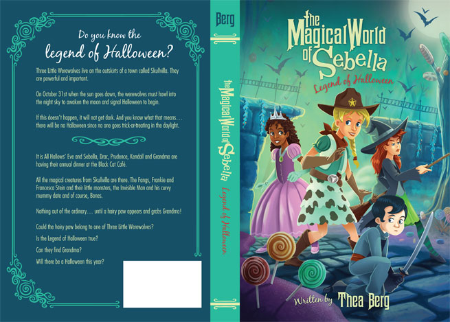
Process for creating a book cover: Legend of Halloween
In this post I’m going to walk you through my process for creating a book cover. A self-publishing author, Thea Berg, approached me to do a cover in her book series The Magical World of Sebella. The first book cover was illustrated by Wilson Williams, Jr. who sadly passed away last year. So I thought it was very nice of the author to think of me to do the second book’s cover. Wilson was a good friend and I was honored that I could continue the work he had started with the first cover.

I’m going to breakdown my entire process for creating the second book cover in the series The Magical World of Sebella book 2: The Legend of Halloween. I’ll show you the character designs, the cover sketches, color comps, my coloring process and finally how I laid the book out in Adobe Indesign. With all that being in this post, it’s going to be a little bit longer than normal, so let’s get started.

My process begins with talking to the client. In this case it was a few emails and a phone conversation. During these conversations we discussed her characters, who her target audience is, and the story. I wasn’t able to read through the entire book’s script so she sent me over chunks of the book that she thought would make the best imagery. In our conversations we kept coming back to this same scene, in which the characters are entering a magical candy garden. This ended up being the area we chose for the illustration to take place in. With all of that out of the way I was able to start drawing. First, I looked at the first book’s cover and the look of the characters that were established in the cover. With this book taking place on Halloween we knew that these characters would need completely new outfits. The first thing I wanted to do was establish the characters’ costumes. We had already discussed what costumes the characters would wear: witch, cowgirl, Princess, and ninja costumes. When I’m designing characters I usually start off with a silhouette of the character but since a majority of that was already established from the first cover I was really able to focus solely on the characters’ outfits. I started with really rough sketches and then continued to refine. By dropping the opacity of the layer of my last rough sketch, creating a new layer and continuing to draw over the top of the last sketch, I refined the image until I came up with an image that I’m happy with. Once I created a sketch I enjoyed, I darkened the line work and added some color. Then I sent the designs over to the client for approval. The sketches were approved rather easily with one minor change; the witch character looked a little old. I reworked the image and was on to the next step of rough sketches for the cover.

Again, this process went by fairly smoothly which is somewhat unusual. Normally, there are tons of revisions and thumbnail sketches but the author seemed happy with the work I was producing so things went quite smoothly. I presented the client with three thumbnail sketches and as is typical with this process when presenting multiple options to a client. She liked option two, but asked for elements from each of the other sketches to be combined into a final tight sketch.

With option two from my sketch phase as the base for my tight sketch I began reworking and including the requested changes. She asked for a few of the characters to be in different poses from the other options and make the characters a little bit more front and center. She enjoyed a few of the candy elements from option one and so I mashed these ideas altogether and came up with a rough layout. From there I again reduced the opacity of my Frankensteined sketch and continued refining. Tightening up the sketch from the previous sketch, dropping the opacity, creating a new layer, sketching over the old sketch, dropping the opacity, creating a new layer, and continuing this process until I ended up with a tight line drawing.
The final step before I begin adding color is a color comps stage. This is where I take my tight sketch of the cover, shrink it down to a size of about 3 or 4 inches and just rough in some colors. This process is so that I can establish a mood for the cover. The mood I was going for was mysterious and magical, but I also knew that the client wanted the cover to be bright and colorful so I played with three different ideas. The first feels like fall and a little too ordinary with not enough magic. Option 3 felt too ominous, like a volcano had just exploded in the background. In the second option I played with the sky being a teal color which is something that is not normally found in nature. I found that using a out of the ordinary color gave the cover a mysterious and magical feel. Then I proceeded on to coloring with the center option being my color guide.
For my coloring process I screen recorded the entire session of me painting the cover. This process was over several days and the video is sped up quite a bit. I think it took me about 10 hours to paint the cover and the full-length of the video is about nine minutes. I hope you enjoy zooming through 10 hours of my life.
When coloring I normally use five or six different tools: brush, eraser, gradient, smudge, lasso selection, and the magic wand tool. In this case I took my color rough and snapped it to the right side of my Photoshop layout, just for reference as I’m adding color. In this illustration’s case the first thing I started with was a gradient just to establish a base color. From there I roughed in some of the background elements. Once I was happy with the rough background I began adding a base color for the characters. For me, it’s easiest if I use the brush tool and establish the outline of the area I’m trying to fill and making sure there are no open areas. Using the magic wand tool I select the inside of the area. Once that selection has been established I expanded anywhere from two pixels to six pixels out as to avoid the nasty pixel ring that can be left behind if you don’t expand your selection. To do this quickly I create an action in Photoshop that expands my selection two pixels out. Once the flat colors are laid down for all the characters, I begin establishing some quick shadows on the characters using the gradient tool. I know a lot of artists don’t like to use the gradient tool, they say it makes it feel more computer-generated and for the most part I agree. Since this is just the base and I’ll come back painting over these areas later, I don’t have a problem starting with the gradient tool. It just helps me define shapes. Now I’m going in and adding a few lines to faces and areas so I won’t need to use my sketch layer anymore. I never delete the sketch layer until the end because I will refer back to it several times.
At this point (2:00 minutes in) in the drawing I’m looking at it and not really enjoying the way the characters are turning out. There’s a lot of things that I could nitpick about it but instead of scrapping the entire picture I decide to focus on the background. Hiding the characters layer I find myself enjoying the task of painting the background and it really energizes me for the rest of the image. Sometimes I find myself worrying about silly things like the way layers are organized and making sure I use selections so that I don’t paint outside defined shapes. When I feel this way I normally do the scariest thing I can, which is flatten the image. It helps me let go of all that silly stuff and just paint.
Once again happy with the background, I turn my attention back to the characters. When I find myself unhappy with a part of the painting it’s nice to focus on something else and come back later to the problem areas. Just don’t wait too long. Remembering to flip the canvas horizontally helps me see the problem areas of the image. By flipping the canvas you can see the image in a whole new light. Sometimes I’m staring at a drawing for too long and I start to gloss over the mistakes I’ve made. In this case a characters eye was to low on his face and when I flipped the canvas I was able to correct this mistake (3:30; it goes by really quick). I continued to add details where needed. I added some needed color to the sky and bats flying in the background. Now back to refining the characters. I start adding darker shadows and highlights of the edges of characters to help better define the light sources. Finally, I add details, details, and more details. My last few steps are to add some missing pieces of candy (7:45). A color adjustment layer and a dark blue gradient from the top of the image to help sell the idea of night. It also helps the title pop off the page a bit more.
Once again I send this image to the client and her only change is to make the text “The Legend of Halloween” a different color.

Now that the cover is approved it’s time for me to lay out the artwork in Adobe Indesign. With this cover there was also a design element which was designing the back cover and spine of the book. The author had already sent me the text for the back, so it was really just a matter of defining the colors, coming up with some decorative elements, adding the UPC code area and applying some of the design elements from the back cover to the spine.
I hope you enjoyed my process for creating this cover. It was well worth it and I really enjoyed creating it. I really appreciate Thea Berg allowing me to share all of this with you. If you have any questions about this process please leave them in the comments below and I’ll be sure to answer them.
Norm
Growing up on the shores of Maui, Hawaii, Norm has always loved drawing. Since leaving the islands’ beautiful beaches and landing in Oregon, he went to college and received a degree in graphic design as well as an additional degree in digital prepress technology. After graduating, he worked for an interactive media firm in Corvallis, Oregon. While there, he was the company’s lead illustrator/designer and was responsible for creating illustrations, animations, and interactive products like video games. Now living in Beaverton, Oregon, Norm worked as an in-house illustrator for 10 years at a large education company in downtown Portland, Oregon. While at this position, he was the creative mind behind nationally marketed campaigns, numerous brand identities, toy and product designs, children’s books, as well as Web and interactive designs for the company’s design team. After leaving this position to raise his son, he now spends countless hours perfecting his craft as a freelance illustrator. He has worked with companies like Highlights Magazine, Houghton Mifflin Harcourt, Reading A to Z, Kaiser Permanente, KinderCare, and the Oregon Museum of Science and Industry (OMSI). He has created projects such as marketing illustrations, children’s books, coloring and activity books, video games, and educational products for these companies and others. Norm’s ability to draw has given him the chance to do the thing he truly loves: Create.

Leave a comment