Schoolism Live San Francisco 2015 – Day 1
Today, July 18th, I was able to head to downtown San Francisco to go to a live Schoolism event. This workshop featuring some pretty amazing artists. I got a two day pass for this conference so I was able to learn from some icons of the entertainment industry. The weekend agenda went as follows;

Day 1
STORY ILLUSTRATION with Helen Mingjue Chen
COLOR AND LIGHTING FOR ILLUSTRATION with Ryan Lang
PICTORIAL COMPOSITION with Nathan Fowkes
Day 2
DRAWING CHARACTERS with Wesley Burt
CHARACTER ILLUSTRATION with Karla Ortiz
TBA with Iain McCaig
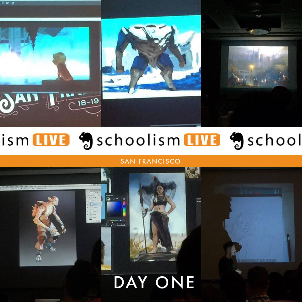
The first day began at 9 o’clock and I walked in about 20 minutes early. I got checked in and picked up my swag bag which had a water bottle in it and a few other Schoolism items. The event was already starting to fill up, so I found a spot about 10 rows back and got ready for the first workshop – Story Illustration with Helen Mingjue Chen. Helen began her 3 hour lecture by walking us through her career so far. From her start at Disney, working on movies like Wreck-It Ralph, PaperMan and Big Hero 6, and into her current position, as an Art director at Paramount. From there, she walked us through a short presentation on what she thinks about when telling a story through illustration. It was a good talk with a lot of good information. My big take away from this workshop was that you need to think of your illustrations for movies as quick reads. The moment you’re depicting will only be seen for a few seconds so the viewer needs to get the information you’re trying to tell in a very quick amount of time. The example she used was if someone had just passed away and you wanted to show the loneliness that the person is feeling you would put them in a room by themselves with all the loved ones old possessions surrounding them. A spot light from the door would highlight the character casting everything else in shadow.

Then she moved on to the live portion of her workshop where she did a live drawing of an environment scene that she came up with right on the spot. It was an image of two cities. One was upside down in the sky and the other was below. The city on the bottom was fairly normal but the upside down city in the sky had lots of Gothic cathedrals and felt much more old timeie. I thought for her just coming up with the image right off the top of her head it turned out well, but she didn’t seem to be particularly pleased with it. However, she did do a really cool trick when creating the lower city. When she created her perspective grid, the vanishing point was right in the middle of the image, and then she said she likes to “cheat”. Opening a new document she began drawing simple shapes that depict the city as if you were seeing it from the top down. These were just rough square shapes but when she put them back into her illustration she adjusted them to fit her perspective grid. It just gave her a starting point for her to quickly rough out the city. For me I’ve always had a hard time creating large cityscapes and this seems like a great way to get the illustration started quickly. I mentioned this to another attendee and they looked at me like “You don’t know that” so maybe I’m just a noob but, I thought it was a helpful tip.

She began working on the top city looking up plenty of reference for different Gothic cathedrals. When that was done she quickly ruffed out a character for the foreground and began adding lighting.
Next up was an hour long break for lunch and after that we returned to hear Ryan Lang talk about Color and Lighting for Illustration. This talk was similar to the first, but Ryan began his talk with a short YouTube clip that he said describes his illustration process. Here’s the video.
Similar to the first presentation, Ryan walked us through his career taking a look at movies he’s worked on like Disney’s PaperMan, Big Hero 6 and Wreck-It Ralph. Then he began walking us through a short presentation about his thought process for creating an illustration. This presentation had several very solid tips. He didn’t want to go as far as calling these rules but more like guidelines that you should keep in mind. In his talk, he said that most illustrations he creates are done in five values of gray or less. The guideline he gave was; 0% black, 30% black, 60% of black, 80% black, and 100% black. Another good tip he gave was if you look at the Photoshop color picker the left side of it is all gray. The top starts at a pure white and the bottom left half is 100% black. Anyone can see this just by looking at it but what he talked about that I hadn’t heard was about the other three sides. The bottom half is 100% black but the top half runs from white being in the upper left-hand corner then moving to a 50% value in the upper right corner. Of course you can change the color of this but I didn’t realize that the top right-hand corner was essentially 50% of a value. Then moving down from the upper right corner down to the lower right the value turns to 100% black. I never thought of the top right hand corner as a percentage of grays because the color changes depending on what shade you want.

Once his presentation ended he began showing us several images that he was going to use as reference for his live drawing demonstration. These images were of destroyed buildings which he was going to use as reference for a giant Mech standing on top of them.

He began his image by finding the lightest light of his drawing and the darkest dark and began roughing in the rest of his shades of color. Ryan did his value studies in color which I hadn’t seen before. Most people I’ve seen do their value studies working only in grays and adding the color later but Ryan worked differently. Doing his value studies in color. He worked on the rough value study for the better half of two hours and then finally began refining the image for the last 60 minutes. The image turned out really well. Ryan seem to be a pretty funny genuine guy. He turned his robot into a turtle mech which got a pretty big laugh from the crowd.

Snagged from Ryan Lang’s Instagram
The day began wrapping up with a half hour break and then the final presenter of the day was Nathan Fowkes. My mind was struggling to find room to hold any more information but Nathan had every intention of filling every last braincell I had. Which wasn’t a good thing, because I don’t know if any of you have ever heard Nathan Fowkes talk before, but this guy has a lot of knowledge to share. Which lead to a lecture that had a lot of information in a short amount of time. His lecture was about pictorial composition. He began this workshop more like an art history class and talked his way through old masters and how he applies what he learned from them to his own work doing visual development for movies. The majority of his talk was about unity with variety; big vs small, hard vs soft, dark vs light, active versus passive and saturated versus desaturated. Next he talked about how everything you see is made up of hue, saturation and value. The end of the presentation finished up with Nathan showing several videos about how you can take one illustration and change the mood of it just by changing the lighting. For instance he created a castle illustration and changed it to feel six different ways. The first was a very iconic lighting scheme with the light shining through the spires of the castle. Then he took the image in a different direction moving to something that was much more moody like a zombie film.

He then reworked the image to have a storm blowing in. To accentuate this he added a lightning strike hitting one of the castle’s towers. Finally, he finished up with a bright sunny “my little pony” version of the castle. I wish I could remember more about this presentation but my mind was on overload at this point. Sadly my notes didn’t really help. My brain and my hand weren’t communicating anymore, so they were just illegible scribbles.
Day one wrapped up with a group photo and a whole lot of really crammed brains.
Norm
Growing up on the shores of Maui, Hawaii, Norm has always loved drawing. Since leaving the islands’ beautiful beaches and landing in Oregon, he went to college and received a degree in graphic design as well as an additional degree in digital prepress technology. After graduating, he worked for an interactive media firm in Corvallis, Oregon. While there, he was the company’s lead illustrator/designer and was responsible for creating illustrations, animations, and interactive products like video games. Now living in Beaverton, Oregon, Norm worked as an in-house illustrator for 10 years at a large education company in downtown Portland, Oregon. While at this position, he was the creative mind behind nationally marketed campaigns, numerous brand identities, toy and product designs, children’s books, as well as Web and interactive designs for the company’s design team. After leaving this position to raise his son, he now spends countless hours perfecting his craft as a freelance illustrator. He has worked with companies like Highlights Magazine, Houghton Mifflin Harcourt, Reading A to Z, Kaiser Permanente, KinderCare, and the Oregon Museum of Science and Industry (OMSI). He has created projects such as marketing illustrations, children’s books, coloring and activity books, video games, and educational products for these companies and others. Norm’s ability to draw has given him the chance to do the thing he truly loves: Create.

Leave a comment